
What better way to understand concepts big and small than through data visualizations? In this blog series, we bring you a collection of visuals on events, academic theories, and insights around economics and transportation, especially — but not exclusively — from academia and news organizations. Join us to explore and engage with interesting and insightful data visualizations from creators around the world.
Economic activity is strikingly concentrated in cities, bringing in opportunities that more than compensate highly skilled labour for facing the negative aspects of city life, including its incredibly high cost of living. This week’s Data Vizdom brings attention to the factors that make cities livable beyond the usual economic barometers such as income levels and housing prices.
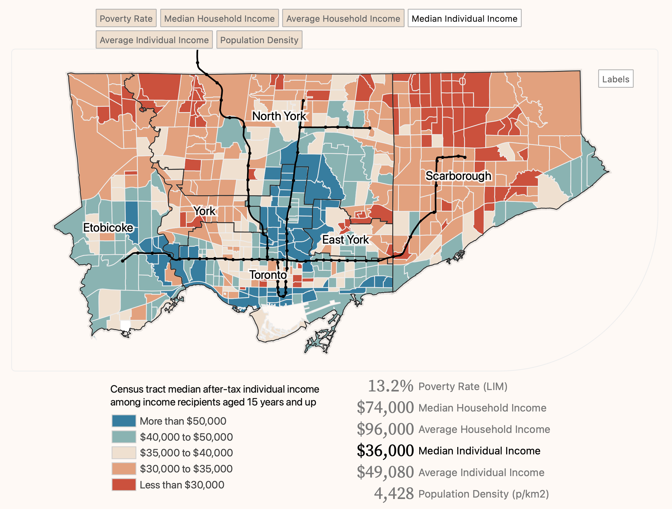
Wealth inequalities and poverty concentration in Toronto – School of Cities (July 13, 2022)
A defining characteristic of cities is their comparatively higher population density. In well-planned cities, this key feature can enhance walkability through the development of alternative modes of mobility that disincentivize the use of cars. A well-developed network of sidewalks, bicycle lanes and public transportation also has a positive impact on the environment and public health.
The interactive visualization below maps cities based on the most used modes of transport by their inhabitants. Among all Canadian cities, Victoria in British Columbia has the lowest car dependency. Explore the modal split of your city to see how walkable it is in comparison to its global peers.
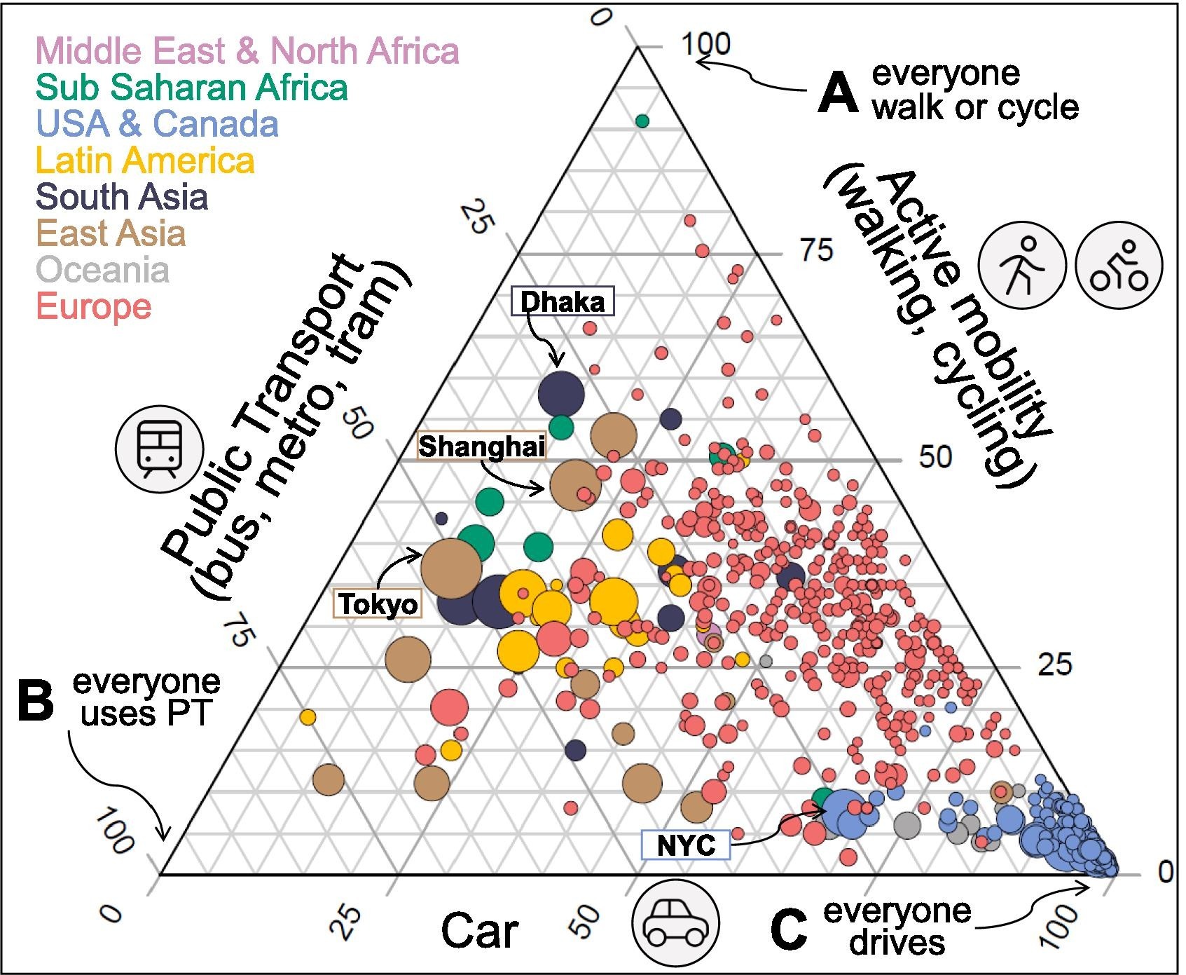
The ABC of mobility – Prieto-Curiel and Ospina (March 2024)
The Canadian Suburbs Atlas provides a highly granular view of in-city mobility within Canadian cities. The interactive map shows the modal split by neighbourhood along with the major transit lines of the city.
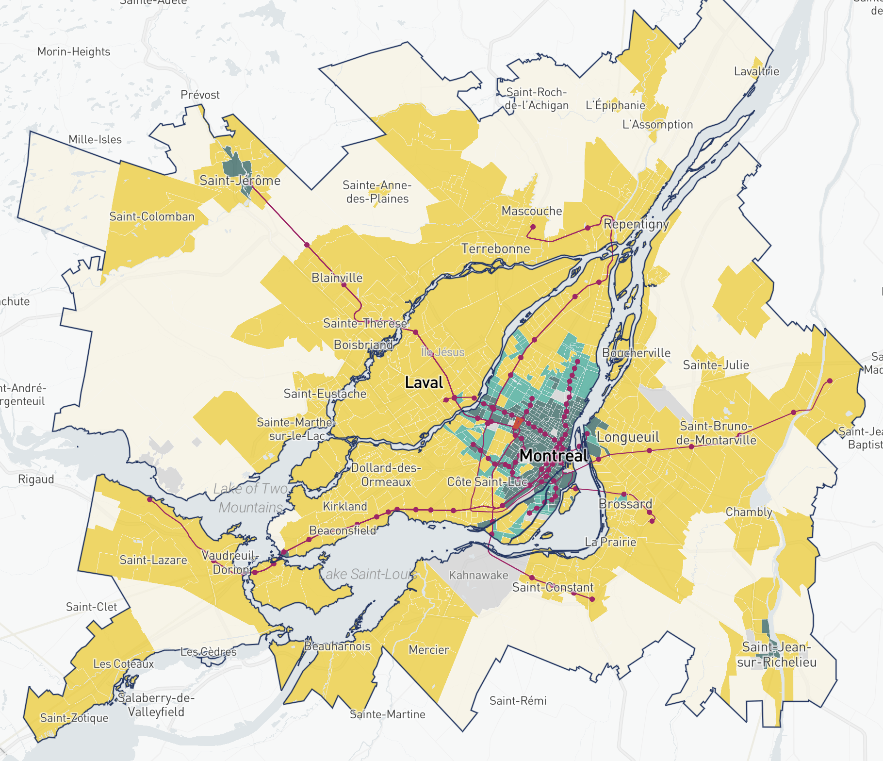
Canadian Suburbs Atlas – Gordon (n.d.)
To accommodate their inhabitants, cities need to have higher density housing, making space an extremely valuable commodity. This often leads to densely built-up neighbourhoods that lack sufficient green spaces. The MIT Senseable City Lab uses Google Street View panoramas to develop a tree canopy index that captures human perception of their environment beyond simply mapping a city’s parks, better representing everyday life in a particular city.
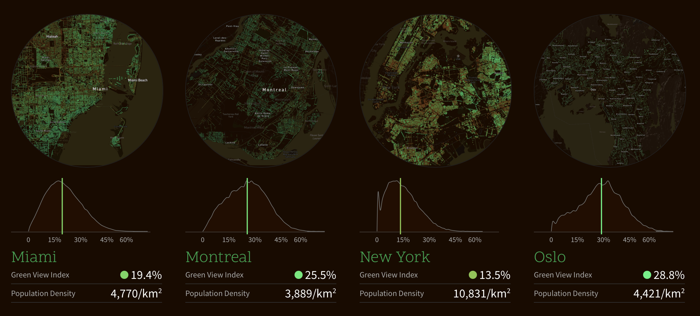
Exploring the Green Canopy in cities around the world – MIT Senseable City Lab (n.d.)
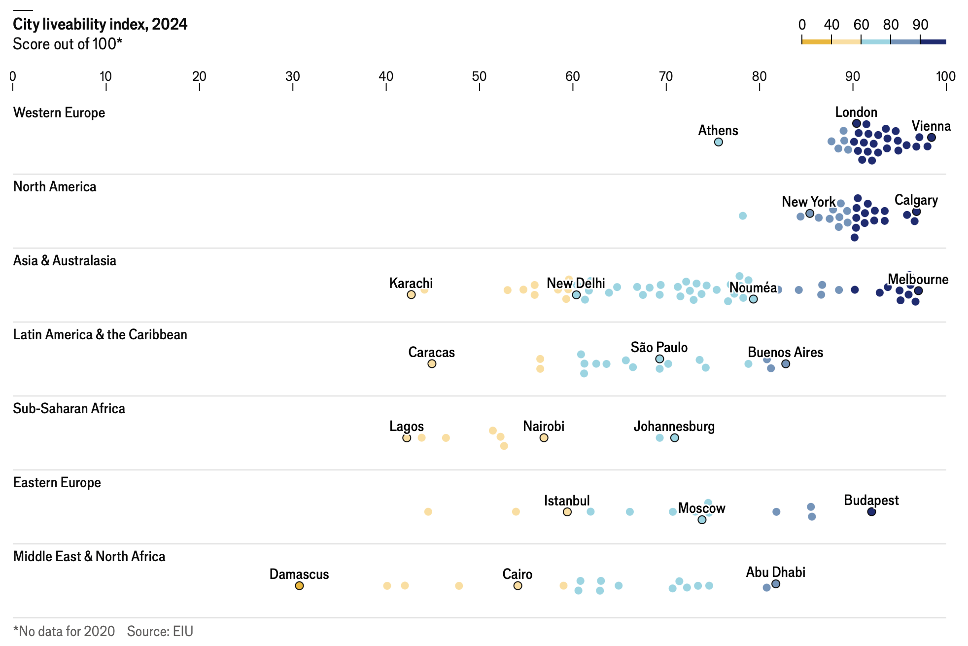
Beyond these two factors, the Economist Intelligence Unit conducts an annual survey that rates 173 cities across five categories: stability, healthcare, culture and environment, education and infrastructure. The following visualization maps the rank of cities on this index, showing the geographical distribution of the most and least livable cities.
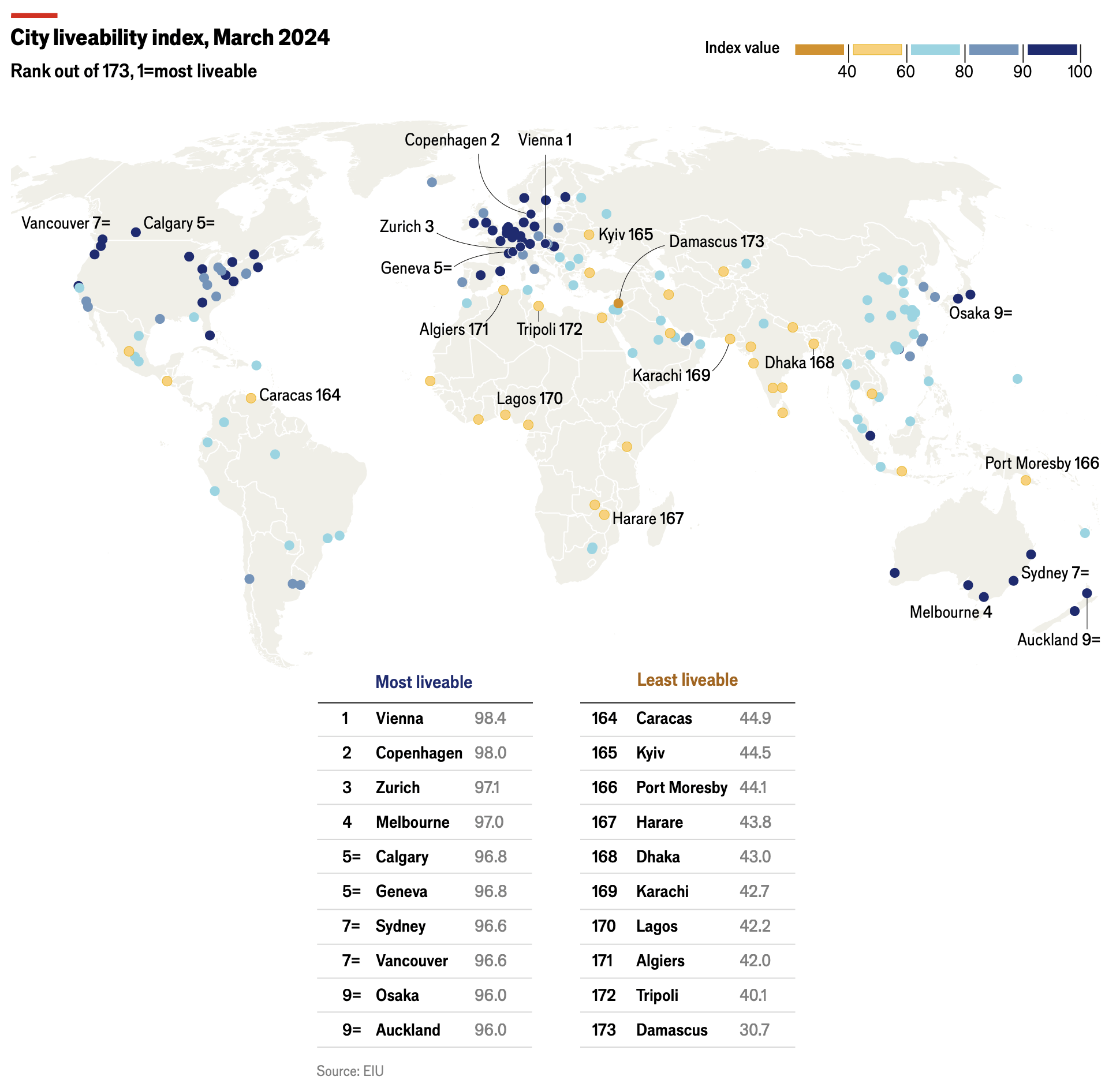
The world’s most liveable cities in 2024 – The Economist (June 26, 2024)
In terms of regional diversity, we see that a large majority of cities scoring over 90 points are located in Western Europe and North America. Most cities scoring between 60 and 80 are situated in Asia and Australasia, while cities with the lowest scores are predominantly found in the Middle East, Sub-Saharan Africa and North Africa.
As the global population continues to concentrate in cities, it is imperative to ensure that they evolve to become more inclusive, sustainable and socially cohesive for their inhabitants.
Help us make this series even better! We would love to hear about sources we should follow to discover interesting projects and visualizations. Write to Bilal Siddika on LinkedIn or via email.